
Yesterday I created a Byte64 linkedin page, so clearly had to create some visualizations to use as a background image. No AI slop would do.
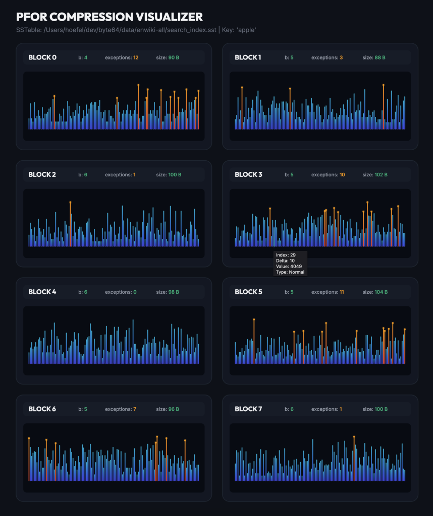
The first thing I tried was visualizing the PFORs the encode my search index. I don’t have a good sense of what the spacing is like between local document ids under a single keyword. I assumed they’re pretty evenly spread out.
Here’s what that ends up looking like. Depending on the number of bits needed to encode the deltas, you’ll see more or fewer steps. The orange lines correspond to exceptions that are too big for the bits used and are inserted afterwards. They’re encoded as pairs of index (one byte) and varint value.
I tried varying the height based on the bits used and stacking them together, but the visual wasn’t great:

Next, I turned to our vector embedding. I decided to use the “Albert Einstein” page as a seed and found all of it’s neighbors — pages that it links to. Next I found all connections between those neighbors by looking through links in those pages. This makes a graph of 405 pages with 4,203 directed edges. Finally, I took their embeddings, projected down to the first three coordinates, renormalized and plotted them on a sphere. Gemini was nice enough to use page rank for the. size and color of the vertices.
Ideally, closely related concepts would be close together on the sphere. But, projecting loses a lot of information and I think special anisotropic projections need to be used to preserve as much information as possible. So, uh, it’s just a pretty picture. (Edit: I looked into anisotropic projections, and they specifically are for dot products and embeddings in all of rather than on the sphere. I think there might not be better projections down to lower dimensional spheres.)
Leave a Reply